Projects at tripla anchor
tripla has created a chatbot service with focus on Japans tourism industry, in which end users can book hotel rooms, restaurants, tours and rent cars. These services are sold B2B and B2B2C. In my position as Lead UX/UI Designer and Front End Developer I focused on tripla’s branding, its internal tools, the look and feel of the chat interface and prepared design for an upcoming traveller service, which is currently in stealth mode.
I worked closely with the development and product management team, reporting to the CTO.
For my work on tripla’s internal tools, I also cooperated closely with operational staff, bridging the divide between the development and operations department.
Finally, I occasionally supported Marketing with branding and art direction for campaigns.
Rebranding anchor
When I began my work at tripla, there were no brand guidelines or strategy in place. The logo was applied inconsistently (different shapes, sizes and colour variations were used across the web, apps and print materials), also the the license of the logo font was in question.

the word mark has some minor modifications
I developed a branding strategy, as well as brand guidelines for web and print materials, while simultaneously planning the redesign for tripla's marketing assets. Logo and wordmark were redesigned with a licensed typeface. The main driver was to have wordmark that could be easily shortened into the "speech bubble" logo that had existed since the companies inception.


logo for print materials & presentations
I will happily admit that the logo does lack sophistication, since I am not a trained logo designer. To create it, I did research and completed a couple of online courses to gain a better understanding of what is needed for a successful logo.
At the time, tripla had an iOS and Android chat bot app (similar to what is on the web). In order to bring the branding to life everywhere, I also created updated logos for each app. These logos were created on a very short turn around time.
This branding work informed the creation of tripla's design system (see below).


iOS & Android app logos
To ease the design process, I began running design sprints, which ran in conjunction with development sprints in 2 week intervals.
I ensured that accessibility guidelines were followed for all design material as well as in code and continuously tested rich contrast and proper code. Furthermore all designs were created with localisation in mind (tripla's chatbot opperated in Japanese, English, Korean and simplified as well as traditional Chinese). To ensure all languages would work with all designs, I tested and supervised QA during all coding stages as well as in pre-release versions.
Finally the need for a mascot / face for our chatbot arose. In discussions with the CTO as well as marketing and product we arrived at the idea of creating a suitcase based robot. I art directed the creation of the final illustrations, based on sketches I had made previously.
project meta data anchor
tasks & tools
- overall design and art direction
- run of design sprints
- design of logo, word marks and icons
- designed with paper, Affinity Designer, Sketch & InVision Studio
time
2016 to 2017
position
Lead UX Designer
Chatbot interface anchor
tripla, at the time of my joining, had already a chatbot interface, but it was very limited and only able to send and receive messages. This interface was used in both, the tripla chatbot web widget as well as tripla's then existing apps for iOS and Android.
At that stage the interface was not extendable, the UI was made wit the original iPhone in mind (320px in width) and not able to support any other screen sizes or resolutions.
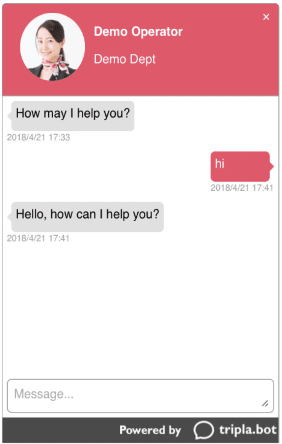
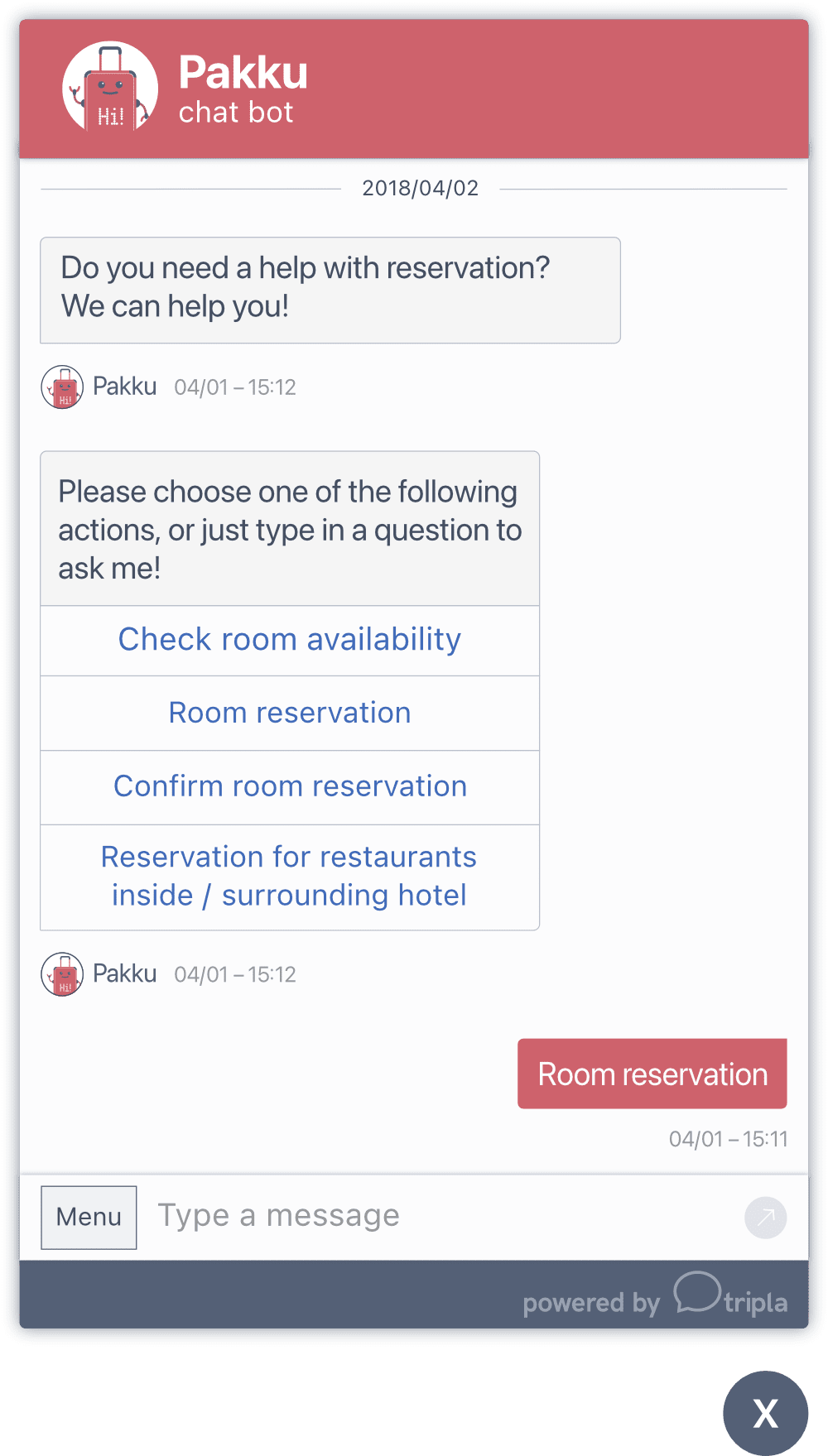
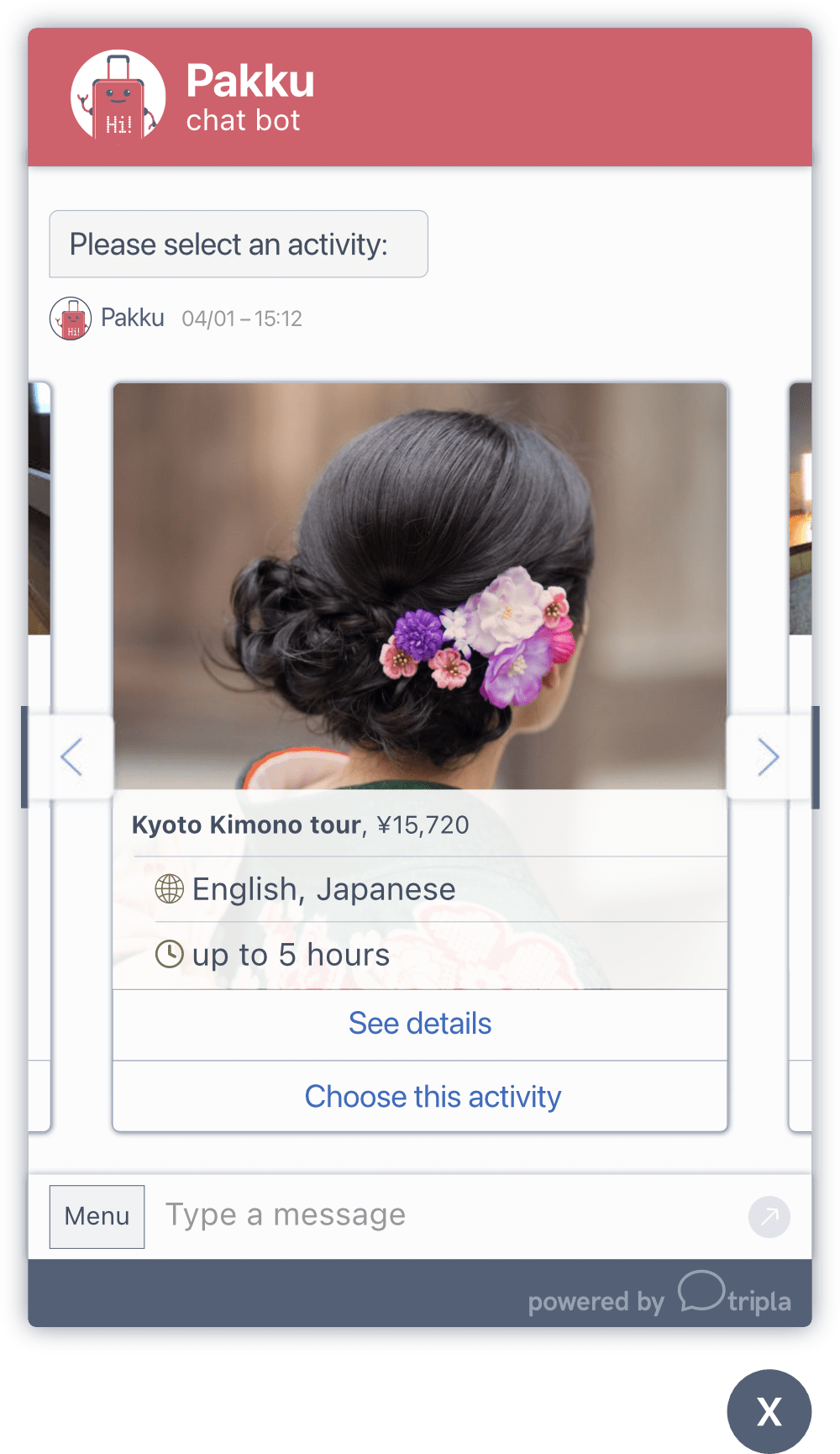
chat widget — final mockup
Since this was the first time I was working on a chat interface, I researched existing chat interfaces, messaging apps and competitors offerings. Additionally I read posts and essays by designers experienced in the field.
I created a modular design with several widgets to extend the core functionality like actions, sliders and overlays for calendar, option lists, etc. While the design was based on mobile screen sizes, it was adoptive to large screen sizes, should the need ever have arrived.
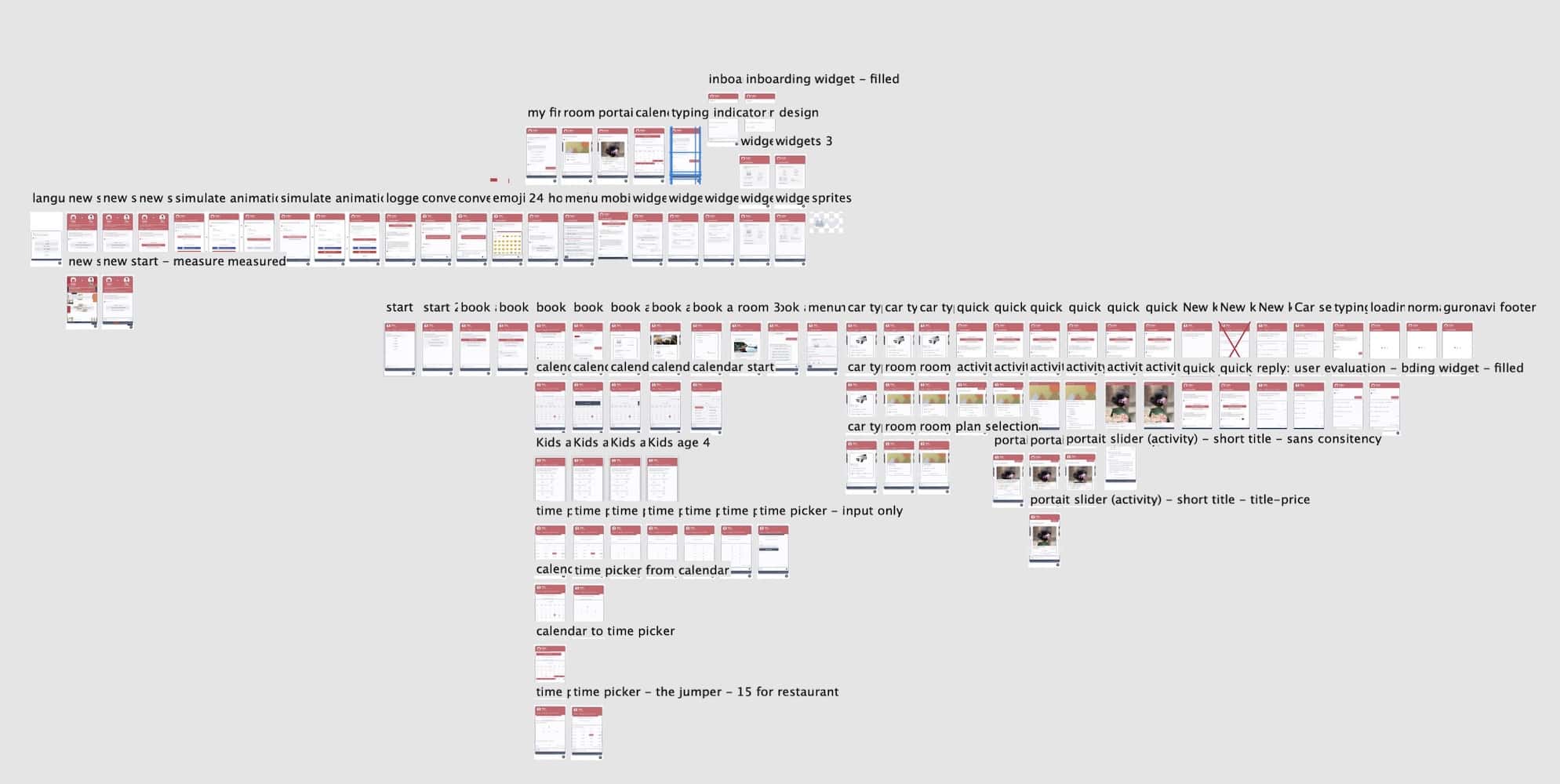
(larger view)
To ease internationalisation, I used a system font stack and finally coded the interface and extension widgets in html/css. Most of the initial design work was done in Affinity Designer and later Sketch, but final designs were done in code and the browser. Icons used where a mix of designs I created and feather icons.
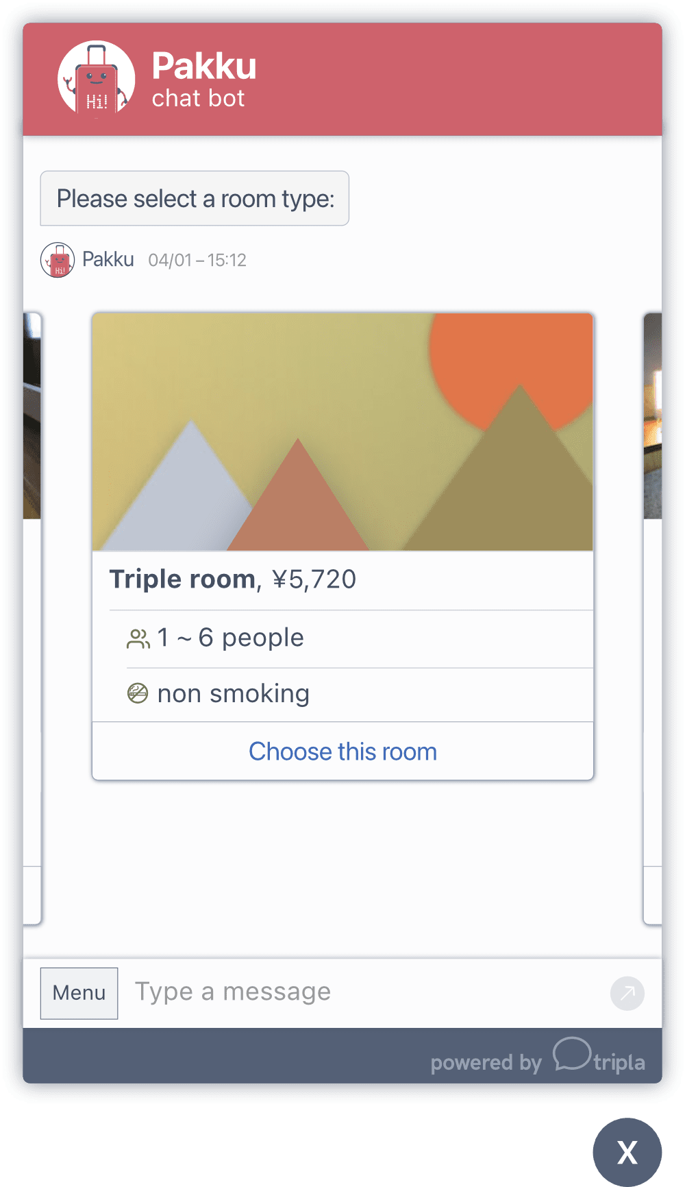
While I was researching other chat interfaces, I was not able to find much literature on how to code a chat interface (especially accessibly). To help other designers and developers I summarised my approach in a blog post.
Running design sprints of the same length and timing as the development team, helped to keep design, coding and deployment at a steady pace.
The the chat interface overhaul improved customer engagement and enabled tripla to begin hotel room reservations. It also allowed tripla gain more B2B customers and was planned serve as the basis for future expansion. The overall style of the widget had proven solid and has been transported into other projects.


The largest difficulty arose from the copy. For chat interactions copy needs to be short, precise and ideally give the bot personality and a friendly character. Interactions like reservations need to be kept as short as possible to reduce exit rates.
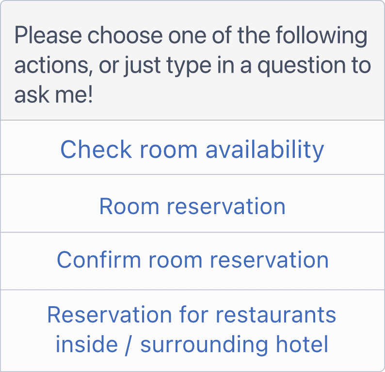
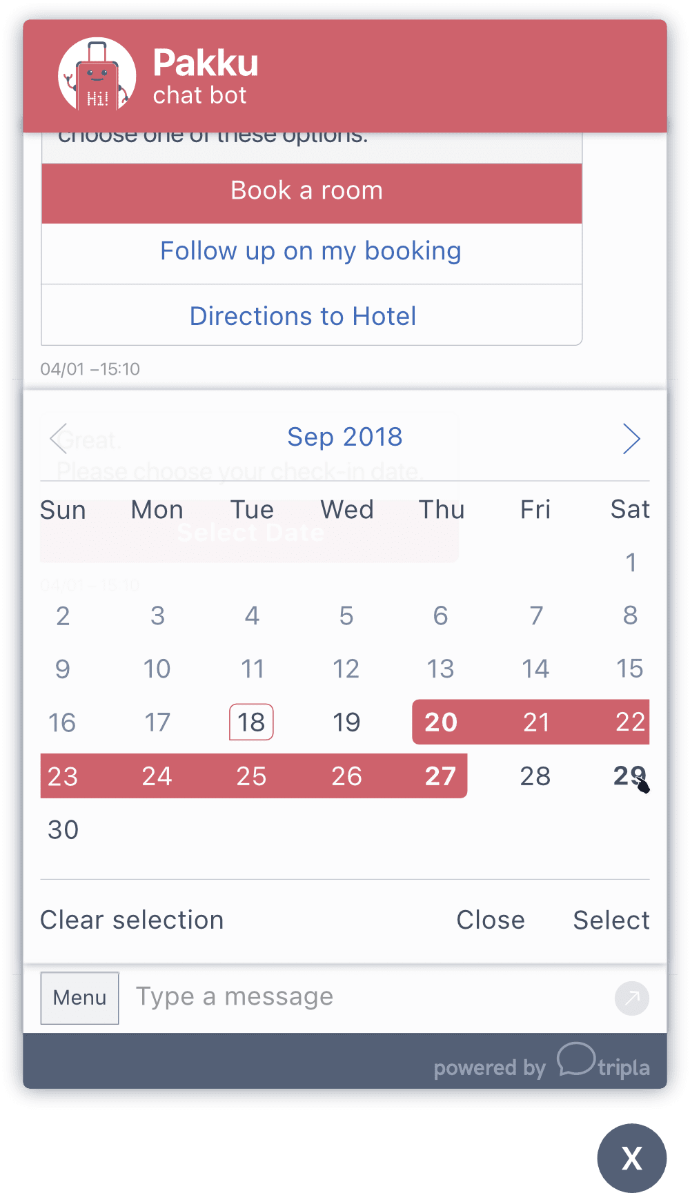
I learned that chat interfaces and forms have very similar UX challenges like the order, length of interactions and what interface options are appropriate in which situation. While creating the interface, studying successful forms helped tremendously.
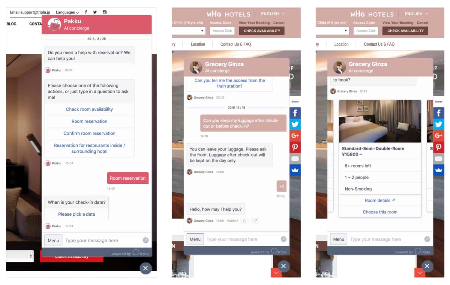
(larger view)
project meta data anchor
tasks & tools
- design on paper and Affinity Designer
- project planning of Front End & UI development tasks in Confluence and Jira as well as code reviews
- coded all HTML & CSS and implemented it into a vue app
- ran design sprints in conjunction with the development sprints
time
2016 to 2017
position
Lead UX/UI Designer, Front-end Developer
tripla design system anchor
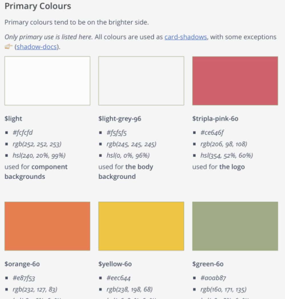
tripla was planning a new service with focus on reservations and recommendations to augment its chatbot offering. The project needed to have the same design language as the chatbot interface. To archive this and expand the design language across all business activities of tripla, I opted for building a full design system.
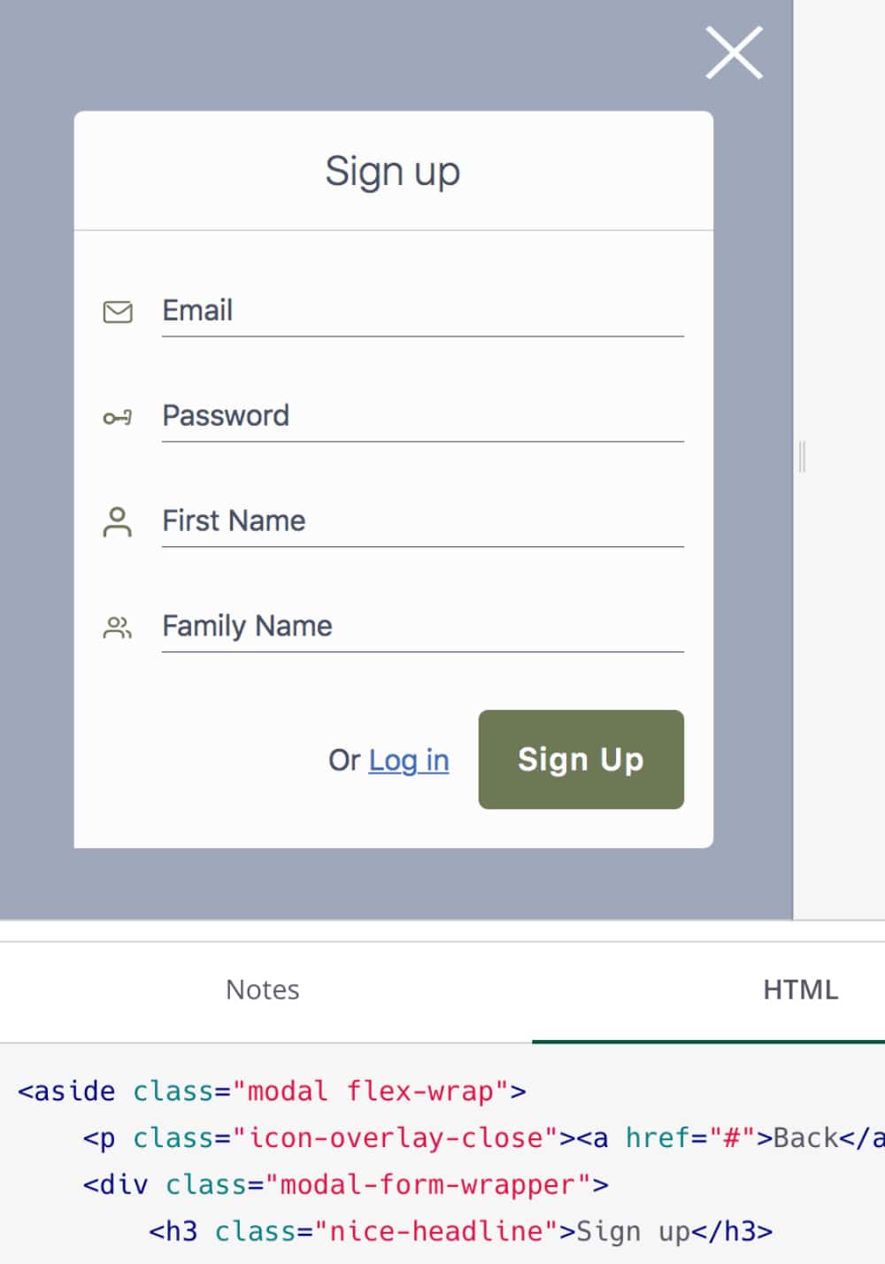
The design system included guidelines for the UX/UI design, HTML/CSS coding as well as UI elements as components and a documentation of their variations inside a fractal installation. The design was done desktop first, but coding mobile first, which resulted in a good balance of style and performance.
With this I was able to create a solid foundation for a design system. While I left tripla before completing the design system, fractal was a great tool to build components, documentation and plan ahead to build a full blown, web based design system. Since the templates all follow the same design language, it would be easy for following designers to build on them.
For this project I expanded the icons I can already designed for the chat interface. In chat as well as in this app, they proved to be a good enhancement for multilingual texts. I created them with non-native speakers in mind, as Japan has guests from around the globe. While English is the most commonly spoken language, adding icons as a universal language helped to make functions easier to understand. The designs were tested in-house with staff from 8 different cultural backgrounds.
project meta data anchor
tasks & tools
- design on paper, Affinity Designer and Adobe XD
- coded & documented all HTML & CSS inside Fractal
time
2017
position
Lead UX/UI Designer, Front-end Developer