Projects at Qurate anchor
Qurate is creating a Platform as a Service or PaaS, to be a one stop tool for Marketing Managers and CMOs, to manage social, app and web channels as well as analytics.
Originally I was hired as Lead Front End Developer, tasked with building a development team in Tokyo (Qurate’s headquarter was located in Fukuoka). My role quickly moved to include operations management as well as coding and UX work for customer projects.
By the end of my tenure I had been in charge of day to day operations of the Tokyo office as well as being the hiring manager for development and marketing positions, had done UX design and coding for several client project (2 highlighted below) and finally helped to disband the Tokyo office as the company experienced financial trouble.
Slush Tokyo Live 2017 anchor
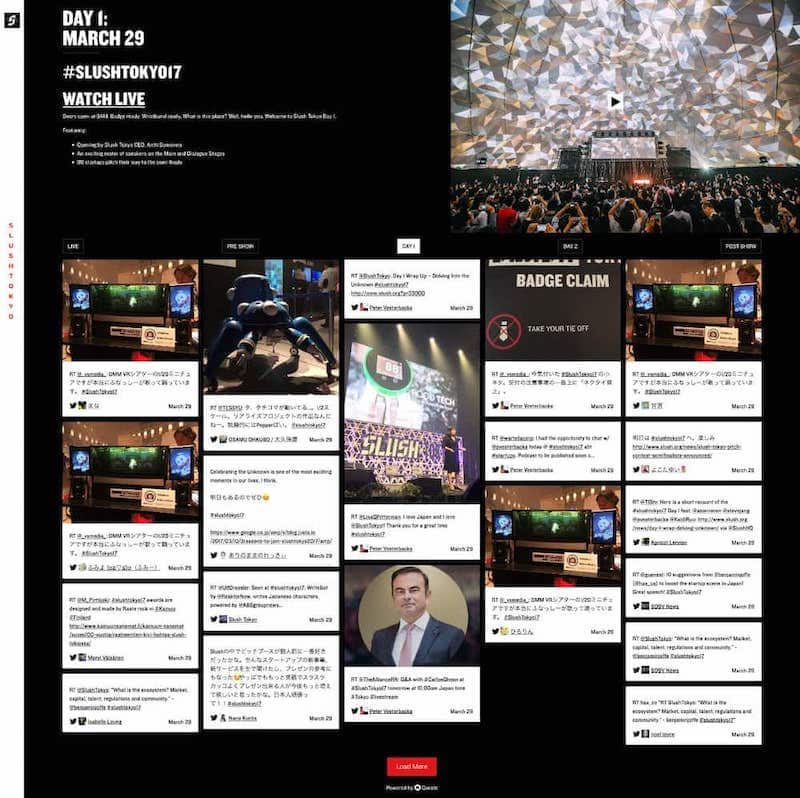
One of the first larger projects the Qurate PaaS was used for was the event social live stream page for Sluch Tokyo. As a Slush Tokyo Key Partner, we were able to pitch the use of our system to the local Slush Tokyo team and were adopted as media partner.

(non-cropped view)
After initial pre-sales sessions, demonstrating to the local Slush media team how Qurate would allow them to automatically get new tweets and facebook posts about Slush and curate a live feed of tweets, facebook updates and links to websites, I became the point of contact for the project.
I first created a design based of the events styleguide and in close communication with both local teams as well as Slush HQ in Helsinki. Since we pitched the idea three weeks in advance of the event, I kept the design and functionality simple, with a focus on the live feed itself. Design and coding was concluded in 2 weeks, with the last week focused on app training over 2 short sessions.
One big lesson I took from this project was about masonry grids. They works well for short, card based content and images, especially when used on a digital kiosk with touch screens, but not so well for non-touch devices with larger screens, as the information density can be overwhelming.
During the coding of the site, I also learned how to create masonry grids with CSS columns, which enabled us to create a quick loading and very responsive site, without falling back on JavaScript frameworks that we had used in the past. These frameworks work well, but tend to add complexity during coding, make pages load considerably slower and can create visible (and therefore confusing) content layout shifts (CLS) when loading on a slower connection.

(larger view)
Since the Qurate app was still in beta, I build a custom beta version of the apps interface with the help of Qurate's Lead JavaScript engineer.
During the Event Slush's Media team used the app to create success, creating a stream of curated content from and around the event. The site itself was the main live stream with an additional video feed from another vendor.
Following this success Slush used a rebranded version also for Slush Singapore 2017, for which I again provided design, coding and tech support.
project meta data anchor
tasks & tools
- pre-sales, planning, design, project management & communication between stakeholders and Qurate
- designs on paper and Affinity Designer
- code in HTML and CSS
- customer support during the event
time
2017
position
Tokyo Operations Manager, Project Manager
qurate.com anchor
After our success at Slush Tokyo, we needed to update our corporate website to better present the product, team and advisors. From a usability standpoint, our website at that point was large screen first, very heavy (around 2MB) and rather unorganised.
The design was created by Qurate's lead UX/UI designer, but only for large screens (set at 1000px width), which left me room for interpretation during coding. The site was to be mobile first, so I designed the mobile layout in the browser in code, using a custom icon font. (These days I would use svg instead, as they are more accessible.)
The design called for a gradient on some of icon in the icon font. At that point I should have switched to more accessible svg icons, but instead learned about the still very useful technique of knocking out fonts.
-webkit-text-fill-color and -webkit-background-clip.
Flexbox was still relatively new at the time, but I could use it create the rather challenging image overflow required by the design. Overall the site was build progressively enhanced, by beginning with a solid html foundation, which would work without any CSS or JavaScript and careful uses of CSS and Javascript to make the site look and feel its best. The result even supported Internet Explorer 9, which was still current in Japan at the time.
I ensured that the page would be super light and load blazingly fast. The average load above the fold on mobile was only 200kb and 926kb on larger screens. This was done by writing very DRY (Don't Repeat Yourself) CSS, using only minimal vanilla JavaScript and optimising all assets, including the custom fonts that were used. The JavaScript portion was again coded by Qurate's Lead JavaScript engineer.
The result was an increase of news letter sign-up's and inquires to demo the Qurate app by 30% in the two weeks following the launch.
project meta data anchor
tasks & tools
- coding the HTML & CSS
- designing mobile and very large screen views
- creation of custom font
- optimisation of all assets and full QA
time
2016
position
Lead Front-end Developer, Project Manager