Projects at Outbrain anchor
In Outbrain I have worked regularly with key publishers from around the globe. These publishers often required unique layouts and styles that went far beyond the standard — off-the-shelf widgets, which Outbrain offers.
During my tenure we had no way of changing the HTML or make changes by deploying JavaScript. I therefore was focused on coding in CSS. At first working with float based grids, later moving on to flexbox and finally adopting CSS grid.
In later years I supported the adoption and quality assurance of new systems and technologies with a focus on operations. This included testing and documenting as well training team members.
My work required knowledge of legal issues General Data Protection Regulation (GDPR) and not using Google Fonts in Germany as well as the California Consumer Privacy Act (CCPA) in the US, et cetera), how to implement widgets in different code environments (react, vue, Google's AMP and Wordpress) and allowed me also to increase my knowledge of accessibility best practices.
After my first year I was expanded my responsibilities to advocate for more accessible offerings from Outbrain. Ad-tech is notoriously inaccessible, but I was able to make some changes and coach different teams on the merits of making our widgets, marketing pages and internal products more accessible.
Accessibility evangelism anchor
In 2021, Outbrain’s product design team sought to renew the Outbrain corporate homepage. I had recently given the team a basic training on what accessibility on web is and how it can effect our users and potential leads.

In this training my team and I introduce the audience to different kinds of disabilities (permanent as well as temporary), as well as basic concepts like level accessibility as defined in WCAG rule sets.
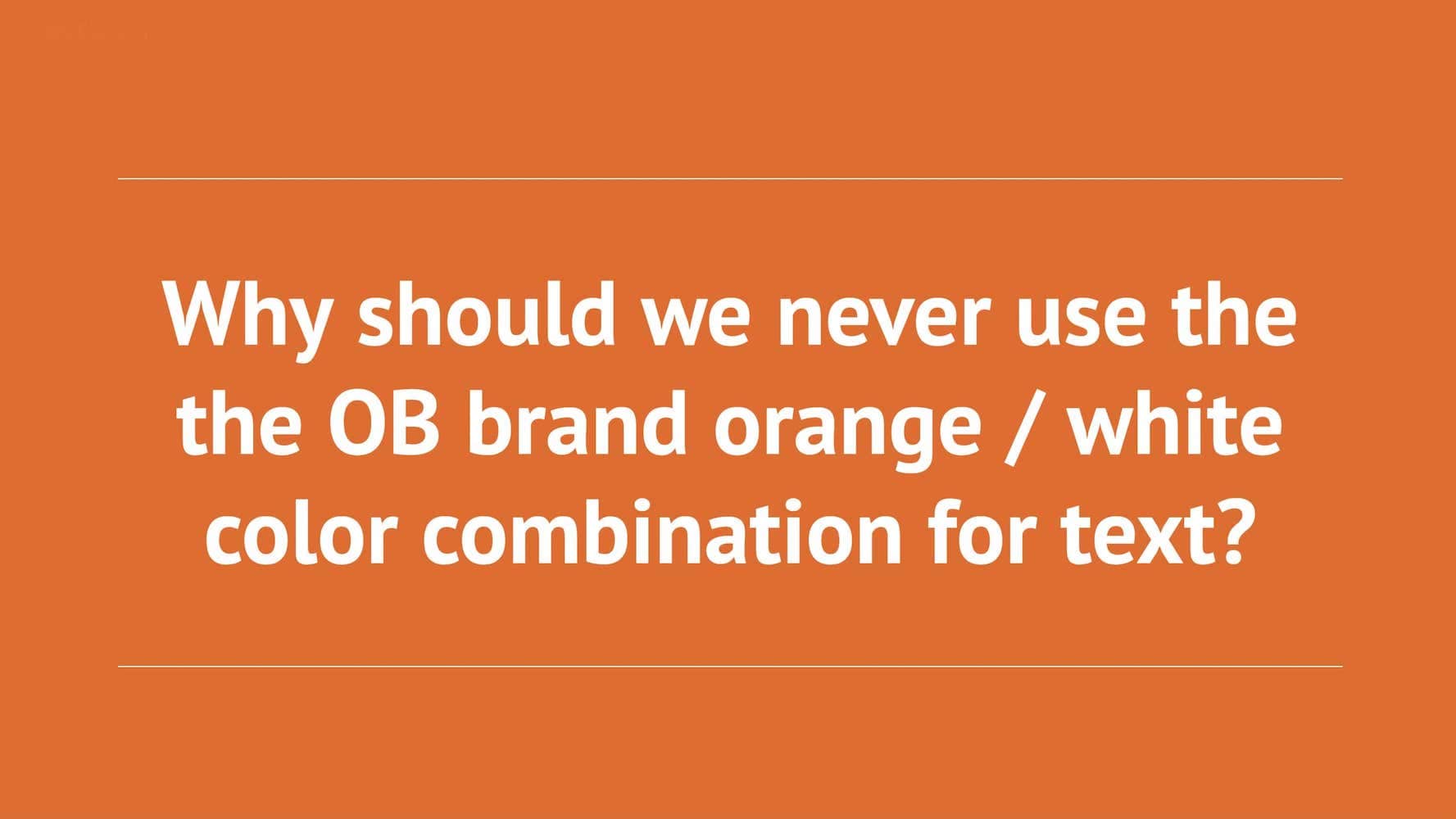
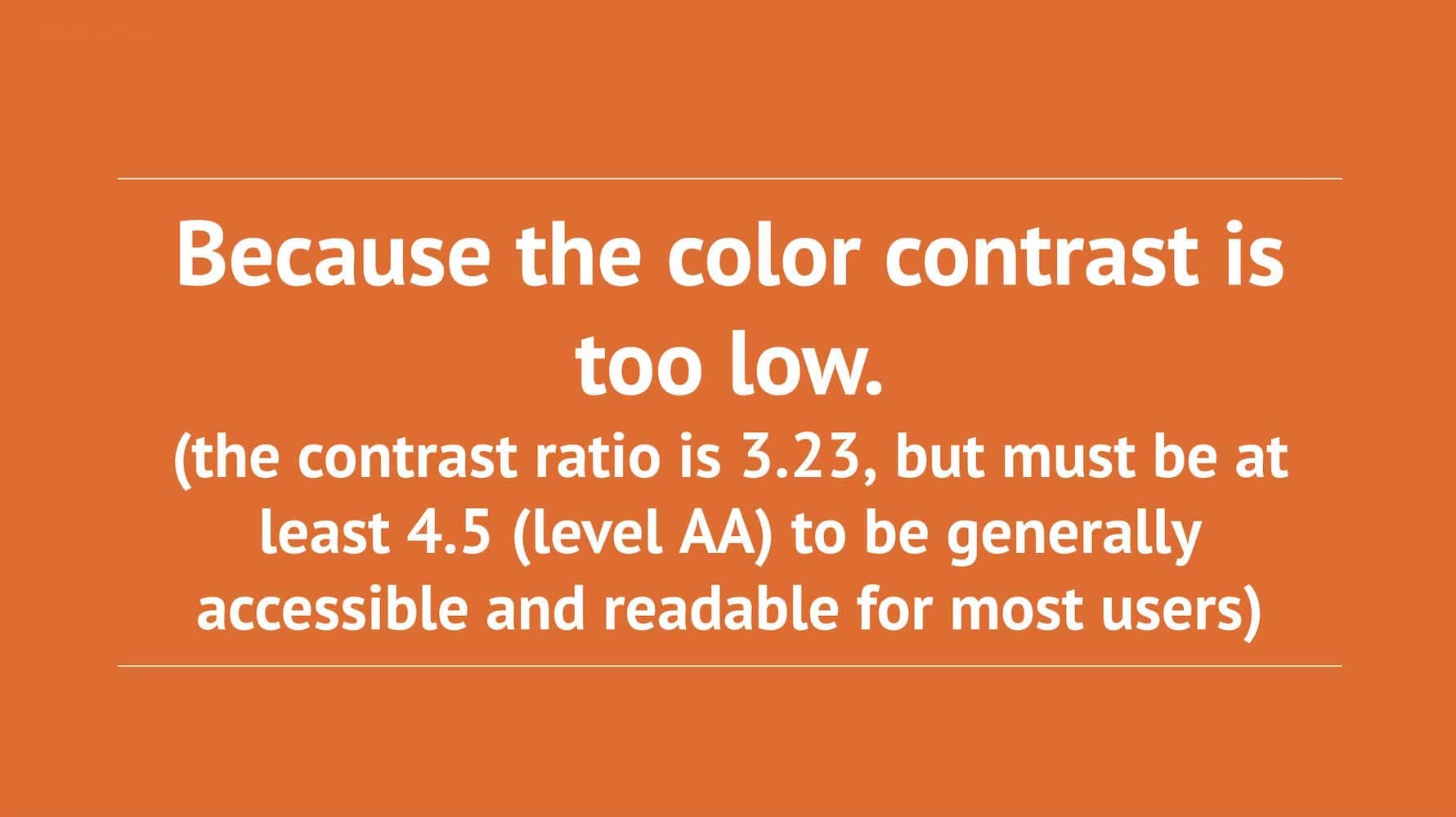
A standard part of this training is asking the audience why the combination of corporate orange and white should not be used.
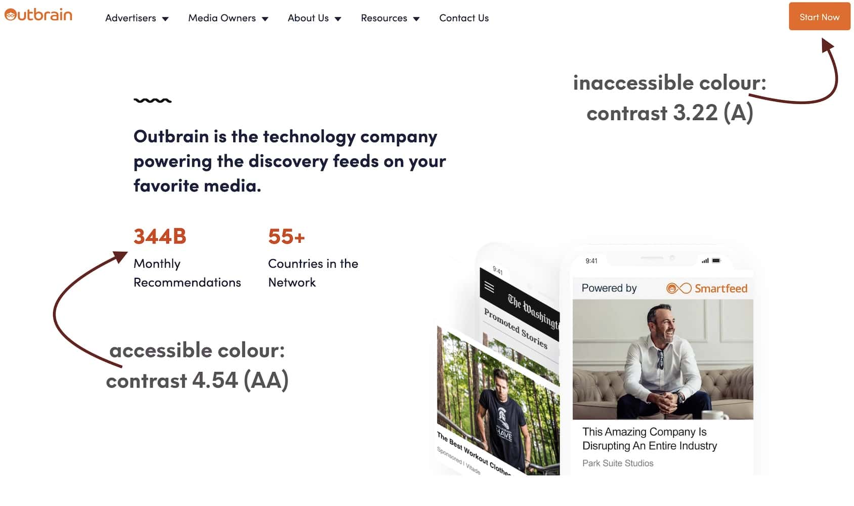
This lead the design team to define a slightly darker shade of orange, which in combination with white achieves a contrast ratio of 4.54 and therefore a level of AA.
In ongoing efforts my team and I have also conducted code and design reviews, which had some positive impact on our internal tools.
The work and trainings has also lead to a broader awareness for accessibility within my team within Outbrain. We were therefore able to better support publisher requests to improve the accessibility of their widgets.
During my time in Outbrain I was enabled to complete two certifications, as well as several related LinkedIn learning courses. All of which were kindly paid by Outbrain.
project meta data anchor
tasks & tools
- company wide training
- documentation of best practices in Confluence
- design and code reviews
- leadership of a small team as a side project
time
2019 to 2023
position
Accessibility Evangelist
A key publisher group in Europe anchor
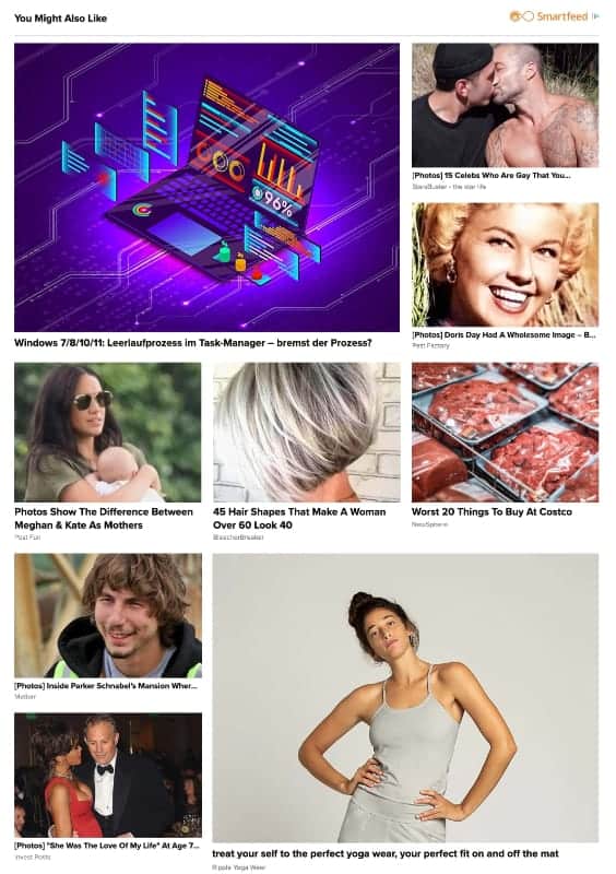
For this publisher we had received a layout where we had 2 small recommendations stacked in one row and one larger recommendation matching their space. While this is a very simple layout to realise, the challenge arose from the way our widgets are rendered into a feed: in single rows, as groups of recommendations. It is therefore not possible to natively arrange them 2 dimensionally. Without access to html, this required a purely css based solution.
The first approach was to simply create a 2 dimensional grid inside a row, creating a 2 column and 2 row layout and place each recommendation implicitly. While this worked, it created distorted images, since all images are natively rendered with the same size, but the larger image requires a different aspect ratio, with longer sides.
(larger view)
The solution finally was in using the container of our recommendation feeds and make it into a grid container. This enabled me to implicitly arrange different child widgets into the required layout, spanning the larger recommendation into two rows and with differing image aspect ratios.
project meta data anchor
tasks & tools
- css coding
- internal and external stakeholder communication
- internal documentation and training on new layouts
time
2023
position
Senior Implementation Engineer
A key publisher group in APAC anchor
This was a redesign project across the publisher groups entities. This example shows a relatively simple design at first glance. What made it challenging, was the requirement to have source titles moved to the bottom of each recommendation, but not fixing the height, as well as having boarders between each row and line.
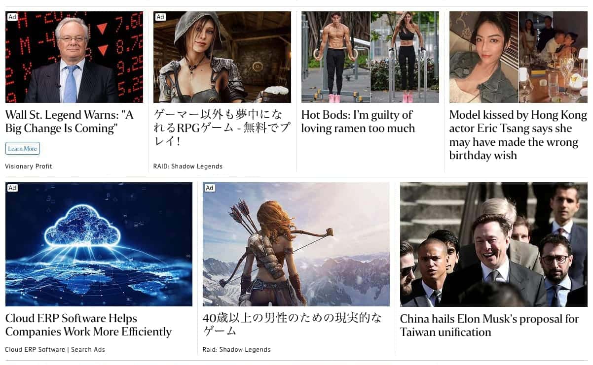
(non-cropped view)
In order to archive the requested text order and spacing, a solid understanding of and overwriting how flexbox is natively implemented in Outbrain's widgets was required. The goal was to have a constant look no matter how many elements (up to 3) were present in each recommendation.
In order to archive the requested text order and spacing, a solid understanding of and overwriting how flexbox is natively implemented in Outbrain's widgets was required. The goal was to have a constant look no matter how many elements (up to 3) were present in each recommendation.
project meta data anchor
tasks & tools
- css coding
- internal and external stakeholder communication
- internal documentation and training on new layouts
time
2020 to 2022
position
Implementation Engineer