Projects for Lothar Tautz anchor
The site of Lothar Tautz started its existence as a political campaign site in 2007 and was originally created by an advertisement agency.
I took over in late 2007, making this my 1st commercial project as a freelance web designer. Since the campaign had not have the desired outcome, I was tasked with remaking it into a site, show casing the current political activities and educational offerings of the sites owner.
Over time articles, essays and speeches were added, as well as a biography and bibliography. In a second iteration, I moved the site over to WordPress, for which I also created a custom theme from the ground up.
Lothar Tautz site redesigns through time anchor
In 2019 Lothar retired and I remade the site as an archive of his writing and speaking. Since most of his work is based in his own experience in the East German opposition, it is of historical value and it is being expanded.
Timeline anchor
- 2007 to 2008: political campaign site, build on a custom CMS
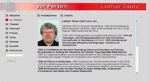
Lothars Website in Version 1. This version was created by an agency in Dresden, Germany. (larger view) - 2008 to 2012: static site with new design, which was really not good as I was still a very young designer and coder at the time
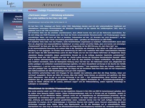
The second iteration. I was still a beginner and had no real idea about contrast. (larger view) - 2012 to 2019: Wordpress based custom CMS with vastly improved styling, accessibility and performance
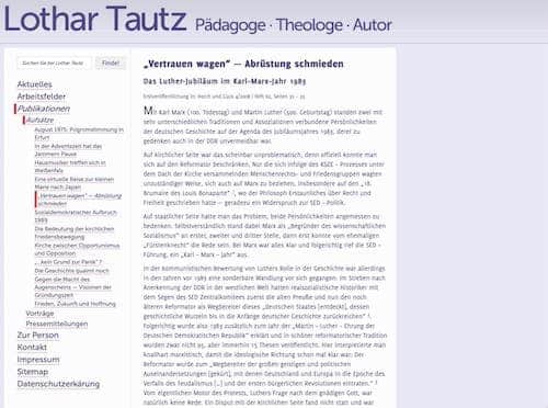
The third iteration: the return of search, better navigation and accessibility. (larger view) - 2019: static site again, with some design updates, first time responsive design and strongly improved performance focused front end coding
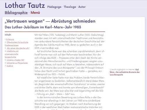
The forth and current iteration: largely the same design, but better html. Also, the navigation was simplified and moved to the footer, the left nav is now an index. (larger view)
Process Documentation anchor
I approached Lothar about a mobile friendly site refresh in 2018, but we decided to hold off on it until after his retirement in early 2019.
Since Lothar liked the then current design iteration (originally from 2012), I proposed to focus the update on mobile friendliness (the last iteration was mostly fluid, but certainly not responsive) and an update to the typography to improve readability.
The design took place entirely in the browser, aided by frequent feedback rounds with the sites owner.
I focused on creating easily usable, very performant and progressively enhanced templates (though there is always room for improvement), by using CSS grid, removing previously used images for the background and the header and removing gradients and too strong box shadows to make it easier on the eyes. I also increased the contrast between text and body colour to improve accessibility.
Another area of focus was improved typography. The fonts previously used (Delicious for flow text and Museo Sans for accents) had become a bit stale and did not look as good in larger sizes. I replaced them with Now, which is a rounded sans-serif. I wanted to employ a serif font, to ease reading, but Lothar wanted a sans serif type family. Now was a good compromise.
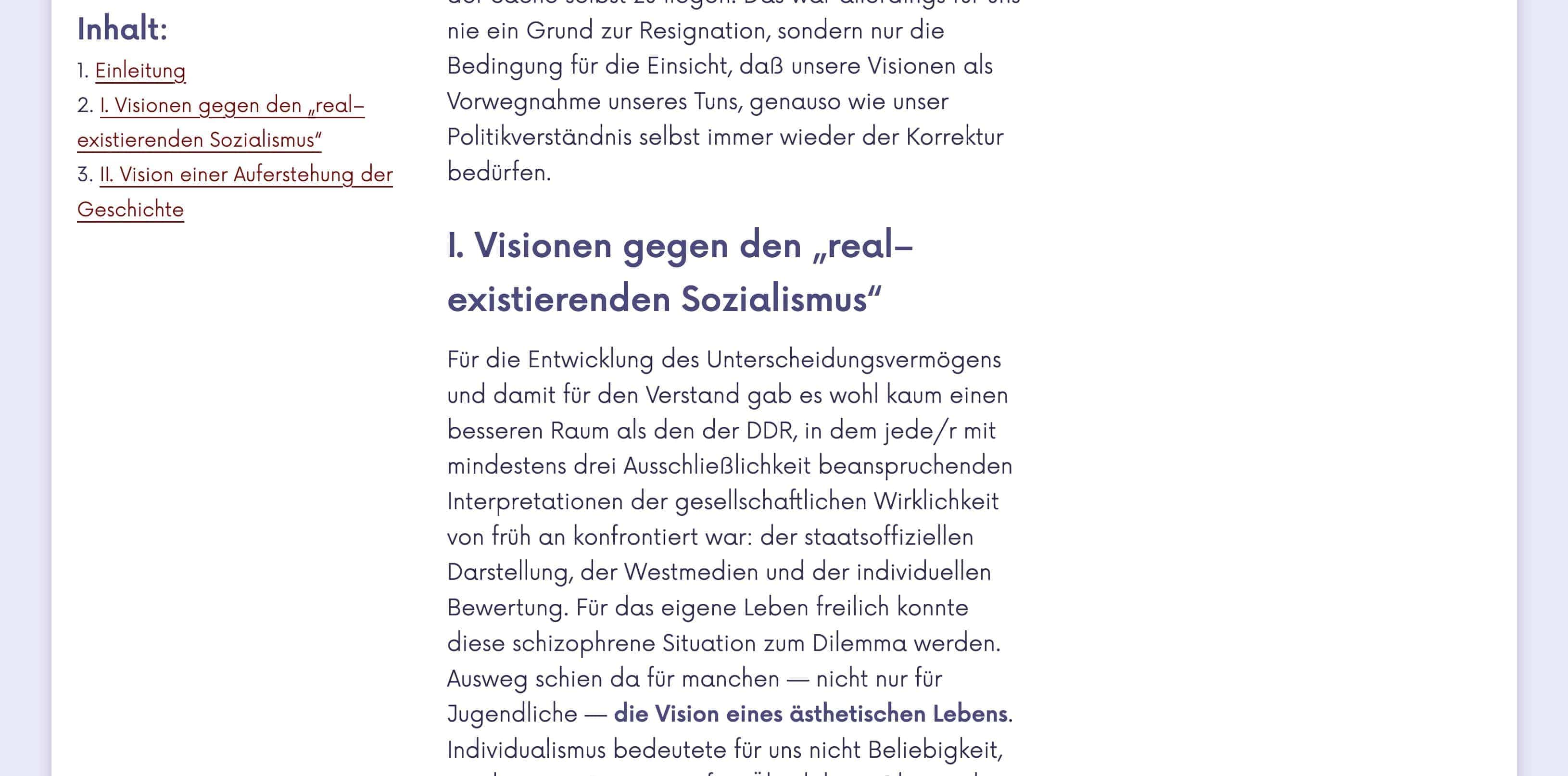
Since many essays are heavy on footnotes I decided to introduce a 3rd column in which footnotes are displayed, usually at the end of each paragraph, but align-self can easily change that. On smaller screens and if no grid is available, the footnotes are displayed at the end of each section or article and linked.
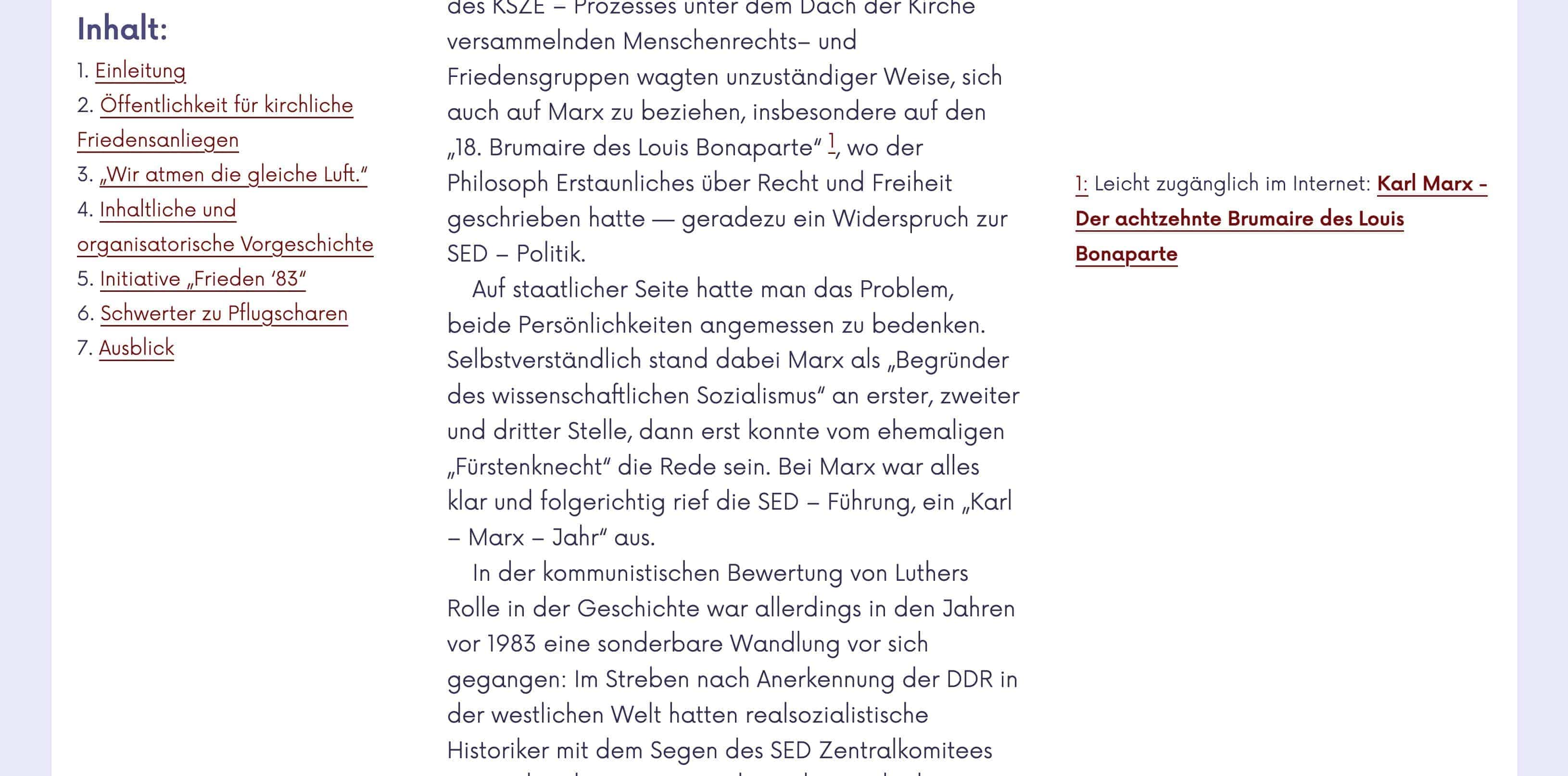
I archived this by displaying each section as its own grid (sub-grid could potentially simplify this) and placing each footnote to its paragraph. I currently have not found a reliable way to place the footnotes right where they appear in the text, but I am looking into that. The Footnote placement is defined in a style element in the head on a per page bases.
The 3rd column is also used on archive pages to show where and when a given text was published.
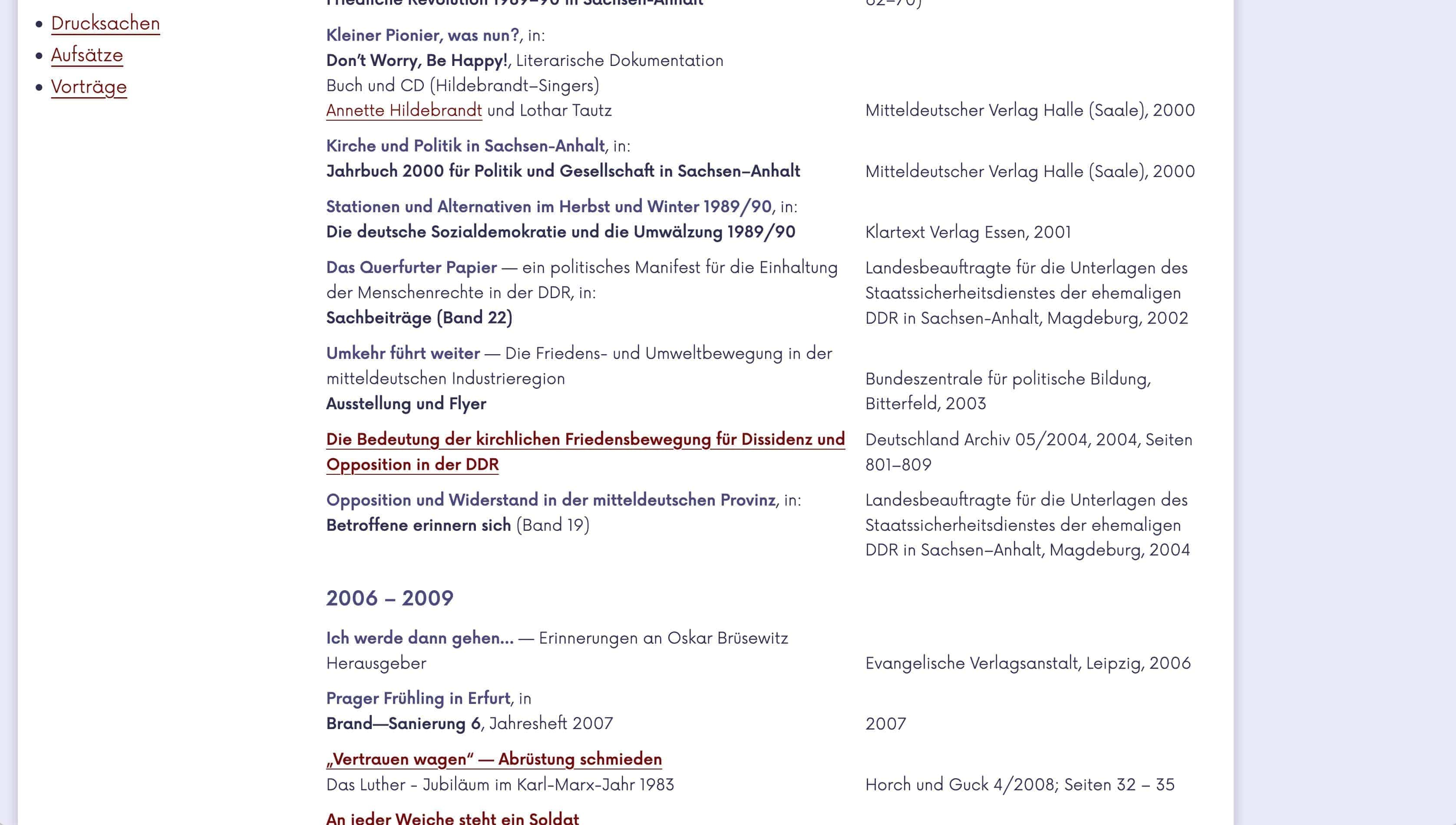
(non-cropped view)
The left column menu, uses sticky positioning. This progressively enhances navigation on larger screens; on small screens and older browsers, the navigation will simply stick to the top. Using JavaScript for this function would be overkill, so I am happy we can do this in CSS now.
In the future I still want to add good print styles so longer essays can be printed well. Sadly printer styles have gone out of fashion, but they still have many uses, one of which is to print to pdf.
project meta data anchor
tasks & tools
- UI and UX design of all site iterations
- front-end and WordPress coding
- site and server maintenance
time
2007 to present
position
Web Designer