Projects at Rakuten anchor
I started working in Rakuten as a Web Director, tasked with improving several KPIs across Rakuten Ichiba’s mobile sites and apps.
One of my first tasks was to clean up the Ichiba smartphone home page. I identified a bunch of unused CSS and HTML elements, as well as some unused JavaScript files and was able to speed up the page loading time by 0.5 seconds on 3G networks, resulting in 0.5% higher CVR and a sizeable increase in revenue.
I proposed to start a project to reduce loading times on 3G networks to 3 seconds on Ichiba's top page, but the project, while CEO approved, never took off. Other projects are highlighted in the following.
Rakuten Ichiba Smartphone Search anchor
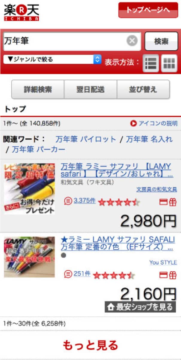
Ichiba's smartphone search, one of the highest revenue drivers in Rakuten at the time, had an auto loading interface which loaded 100 search results at the time. Each search result included at least 3 separate links:
- link to the item (image and title)
- link to the shop
- link to the review overview page
Some search results also included a link to Ichiba's product comparison sites as a 4th link.

This brought about a set of issues I wanted to solve. Some slower android phones froze when using the old Android browser and trying to load all search results. When navigating to a search result and then back to the search, customers always had to start again at the top of a search page. This meant, even if they viewed result number 72, they started again at result 1 upon returning.
Touch targets were very small (around 15px instead of the recommended 40px), as previous designs were not commonly tested on mobile devices.
After studying customer behaviour through data from Adobe Site Catalyst and lab sessions, in which I could study customer usage of the search pages, I created several possible designs, which went through numerous iterations and stake holder meetings. We settled on a plan which included 2 A/B tests.
The first test was to replace the auto loading with a pagination interface and to find the ideal number of search results per page. The second one would test a new interface.

The first A/B test was a full success, with the winning variant improving
- revenue: +2.3%
- Conversion rate (CVR): +0.07%
- and reduced both the bounce rate: -7.89%
- as well as the exit rate -4.47%.
For the first test I created all designs and coded the HTML + CSS. For the second test I worked with a graphic designer on the new interface and coded HTML + CSS.

(non-croped view)
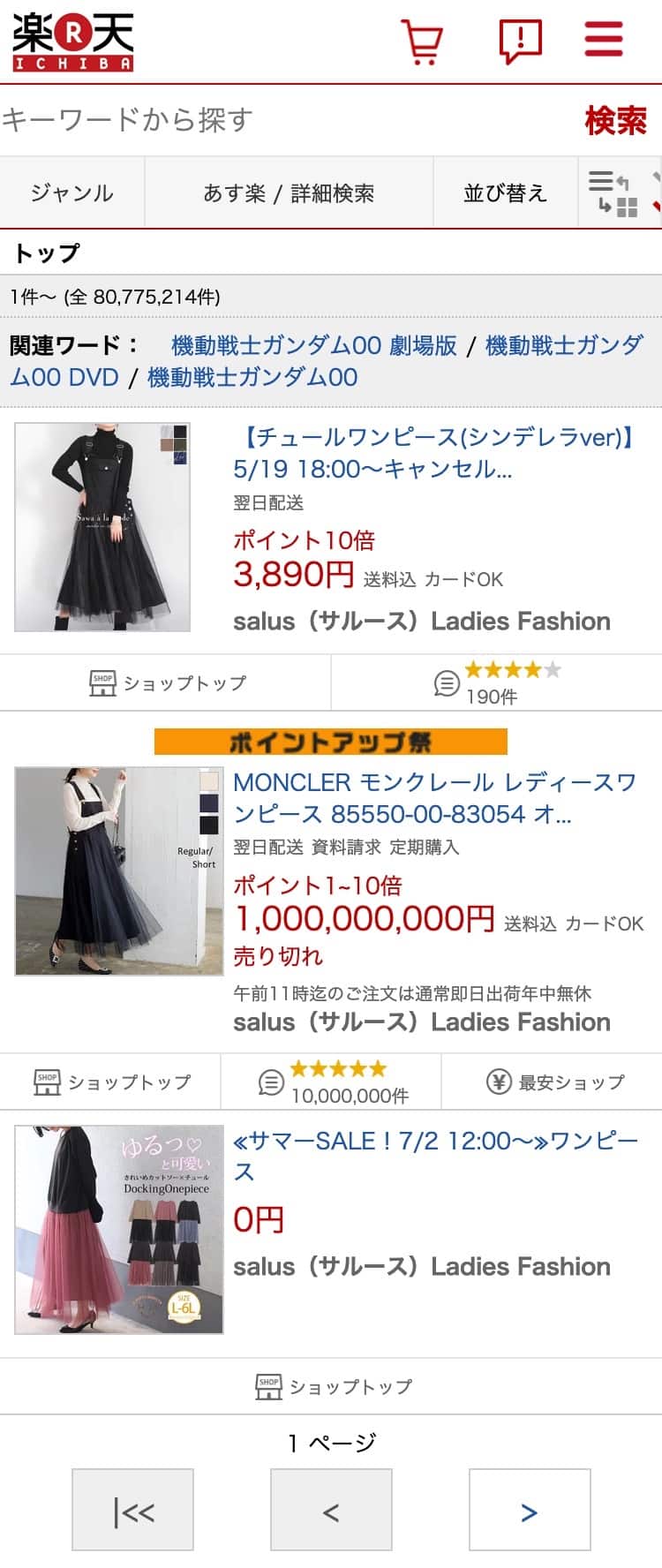
For the second test, I created 2 main views (list and grid view) as well as new designs for all search refinement areas and filters. The design language was strictly following Rakuten's styleguide.
While the second test began promising, it ultimately failed. Revene, CVR and exit rates stayed flat, while bounce rates increased drastically. I noticed my mistake on day 2 of a 14 day test, but was not allowed to stop or pause the test to fix the issue.
My mistake was the image size. As part of my new design I had sought to increase the physical by 1/3 and make them into "retina" images (scaling the image down by a factor of 2). In my tests this did not lead to any issues, as I am always optimising my image assets. I also gave trainings on how to do this to different teams in Rakuten.
In real life, images were not well optimised or compressed. Even a 250x250px image could still have a size of over 2 MB per image. Since images were now much larger then before, they were also much heavier, leading to higher bounce rates. Since revenue and CVR stayed flat, I advocated for a new test (with images scaled with a factor of 1.3 or 1.5). It was decided in the end, that another team member would take over and so only my pagination work was fully released.
project meta data anchor
tasks & tools
- planning, wire frames
- communication with all stakeholders
- A/B test & data analytics
- design on paper and in Affinity Designer
- coding in HTML & CSS
time
2019 to 2023
position
Mobile UX-Designer
Rakuten Ichiba Product Comparison Results Page anchor
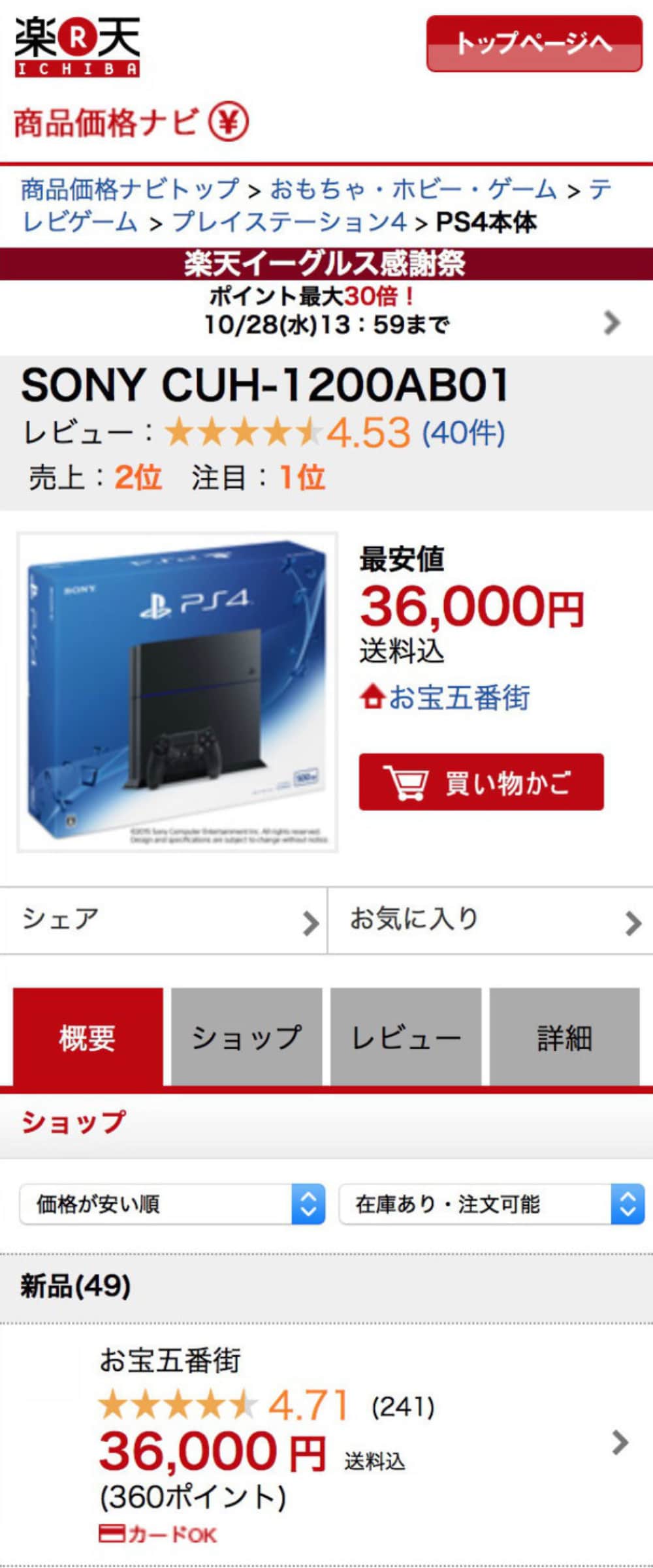
My last larger project before leaving the Ichiba Creative and Web Design Department was to reform Ichiba's Product Comparison results page. When I came to the projet, I took over from an outside vendor who's designs were not up to the quality requested.
The comparison site had a very outdated UI (compared to other Rakuten sites) and many functions present on the desktop site were fully missing. Additionally there was no analytical data for the smartphone version or the desktop version, so all work was based on research, best practice knowledge and stakeholder needs.


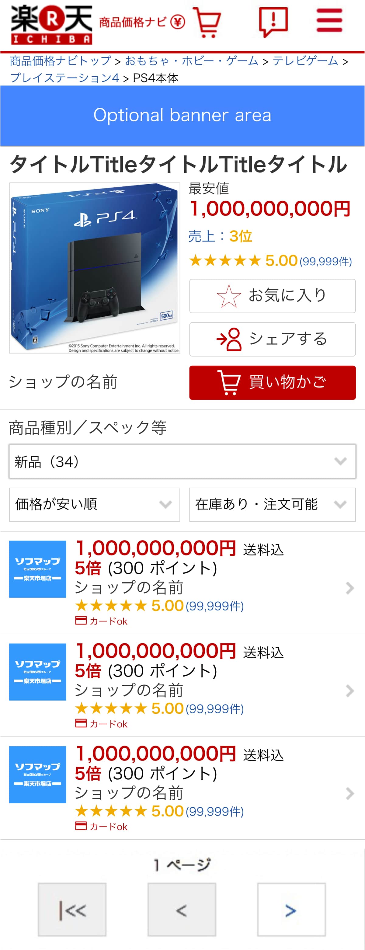
I was able to create a design that used Rakutens current design language, included most functions from the desktop version and met stakeholders demands. The first step was to bring over the pagination we had rolled out successfully on smartphone search before.
The most important lesson I learned from this project is to always get data first. Without understanding which parts of the site customer actually used, my design was based on guess work and stakeholder input which did slow down the project. Nonetheless I would have been happy to see if my work had created value, but I decided to instead work with the development unit in Rakuten for the last 6 months with the company, where I would learn more about project and people management.
project meta data anchor
tasks & tools
- planning, wire frames, communication with all stakeholders
- design in Affinity Designer
time
2015 to 2016
position
Mobile UX-Designer