Projects for Annette Hildebrandt anchor
Annette Hildebrandt was my 2nd commercial customer. When she opened up her cultural project management office, as Projektbüro Hildebrandt, in 2008, she approached me to create a site for her, showcasing projects and work areas she offered services for.
Over its life span, we added books and novels she had written, while I was maintaining the overall contents.
I have done a couple of projects for her, including my first accessibility focused project (the ABC Barrierefreiheit).
Annette Hildebrandt redesigns through time anchor
In late 2018 Annette approached me to remodel her page into a purely biographical site. This site is now focused on her writing. The project was in preparation of her retirement by the end of 2018, giving me a window of roughly 2 months to complete the project.
Timeline anchor
- 2008 to 2013: fully static site with fluid templates, but issues with readability and contrast
no screenshot has survived - 2013 – 2018: updated the site to php, for better maintenance and made it more accessible, focusing on screenreader support and better contrast

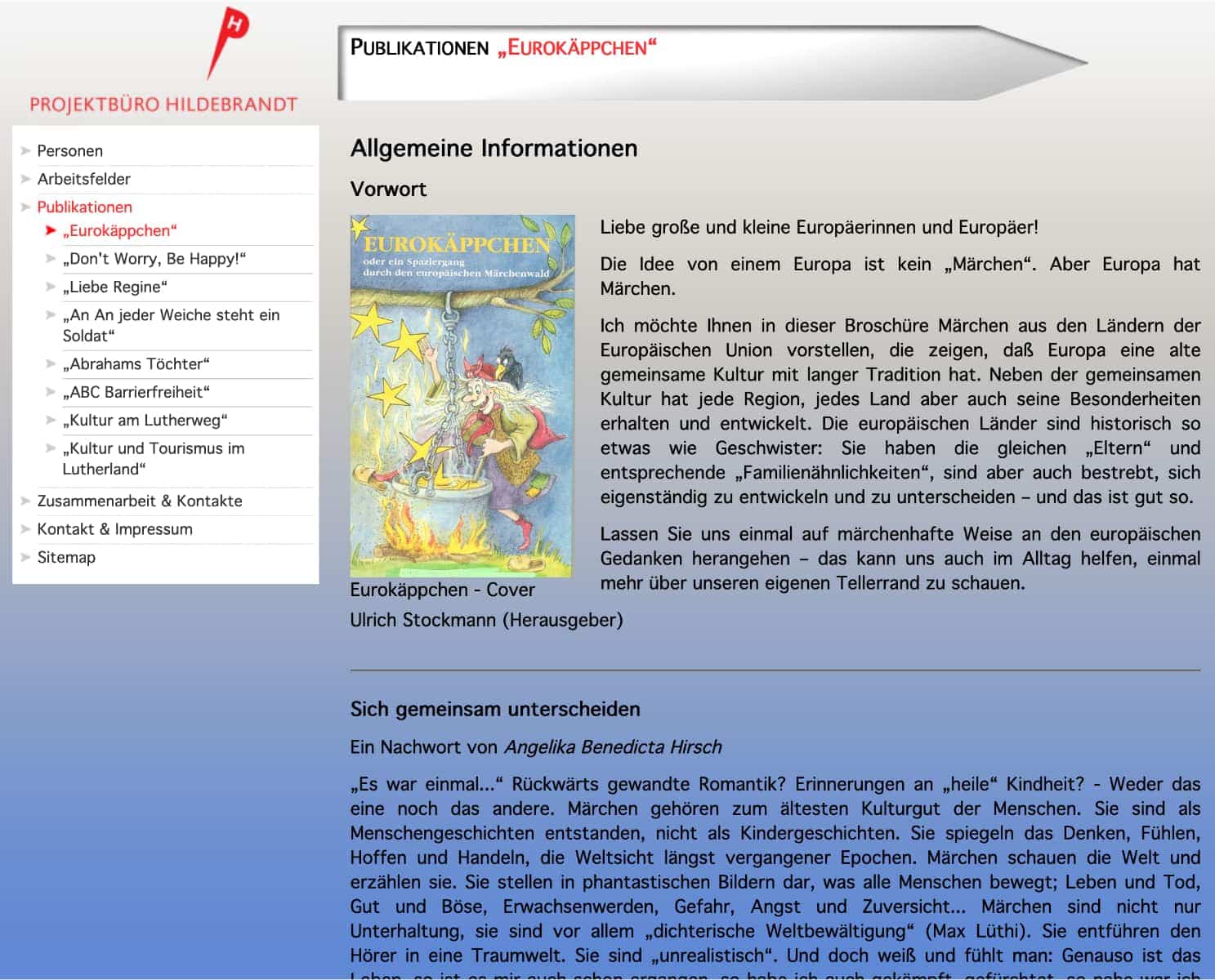
The contrast and layout still have open issues, but met the product owners requests. The background gradient did not move when scrolling, with the (silly) idea that this might help readers who have contrast issues. - 2018 – 2019: complete relaunch as a static site, with fully responsive templates, strongly improved accessibility and usability

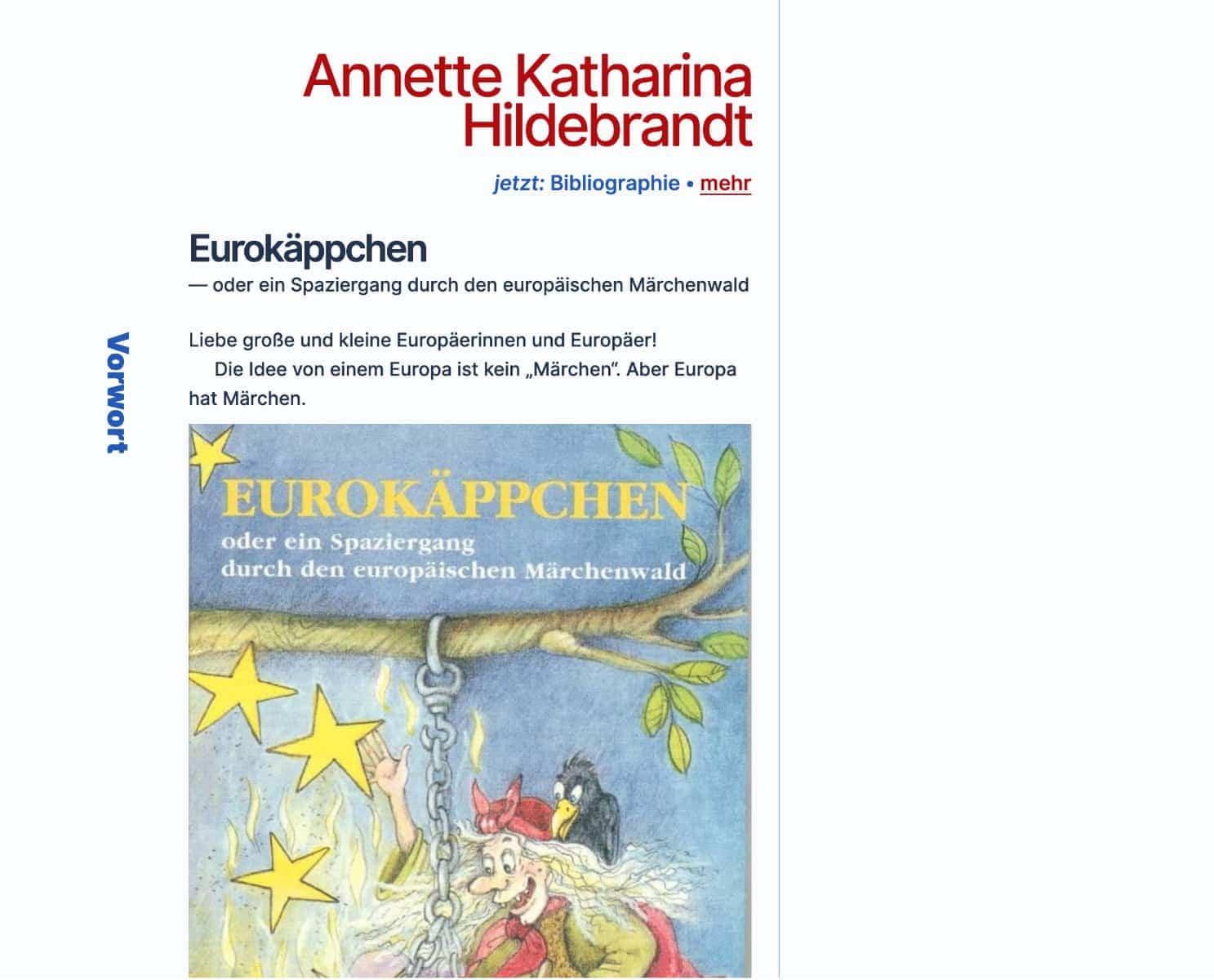
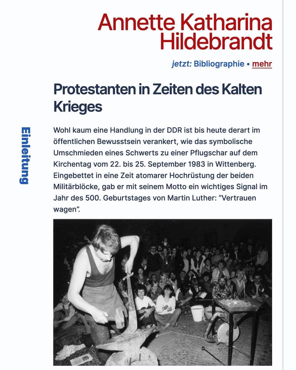
This is a huge improvement in readability, even with a bit too large images.
Process Documentation anchor
In November 2018, in preparation of her retirement, Annette approached me to create a new, personal site for her, with stripped version of the content of her original site.
She gave me card blanche in terms of the design, only requesting to have it launched by January 2nd 2019. This gave me roughly 2 months to design, code and launch the new site.
The site design was inspired by an experiment with CSS writing modes, Jen Simmons had created. Since Jens experiment was about Octavia Butler, it just felt right to create a design based off the same approach.

(non-cropped view)
The 6 sections of the office site were reduced to 3 + 1 (home, Biography, Bibliography + Imprint) and the design was build with a strong focus on readability and high contrast between text and background. My original design from 2008 had failed on that front and badly, so I really wanted to get it right this time.
Annette really enjoys sans-serif fonts (the precious one used Verdana; a ghost from the days where we only had web-safe fonts…), so I chose Inter as a variable, open source option to create a similar, but more modern look and feel.
If we had enough of a budget, I would have chosen a typekit subscription and used Neue Haas Grotesk, but that was not possible at the time and I believe there is no variable front available.
The head line for each section uses the writing mode and falls back nicely, if the used wiring mode is not supported.
With the very short turn around time, I opted for a single column layout with the section headers as breakout items and strongly contrasting colours. This achieves a visually interesting look and feel, while using easy to maintain CSS and HTML.
As a result, Annette wes very happy with the look and feel as well as the short turn around time.
In the future we might add some out-of-print books and I will need to add a proper print stylesheet. While they have come out of fashion for normal websites, I still think it is good to have them around.
Additionally I will have to find a way to reliably subset the variable font. I hope this is possible, because currently it is comparatively too heavy.
project meta data anchor
tasks & tools
- UI and UX design of all site iterations
- front-end coding
- site and server maintenance
time
2008 to present
position
Web Designer
ABC Barrierefreiheit anchor
The ABC Barrierefreiheit was my first ever accessibility related project. I was asked to check the websites of stations along the Martin Luther pathway (or pilgrimage way). I was still very new to accessibility, having just learned about it by reading A List Apart. At the time I also had no concept of what a screen reader is or what assistive technology may be.
My knowledge thus far was how to write well structured HTML and not to use Flash, despite being pushed to it by my customers. I had read somewhere that screen readers basically follow what is in the DOM. Hence a well structured website should be usable for screen reader users.
Besides that my understanding covered readability and basics of colour contrast. (This did not stop me from making mistakes myself.)
In order to check which sites could be used by screen reader users, I took the Lynx and ran it in Mac OS. Since Lynx is a text browser, it will only render text based entities. A great way to check, if links make sense, if images have alt text and back then, if there was any alternative when the website was used in flash. I decided to only check the home pages (sounds familiar?) since most sites were flash based anyway. The same was then tested with Safari and Camino (RIP) to see if the flash pages at least were readable.
Finally, I wrote a report and my findings were incorporated into the Report the Projektbüro Hildebrandt put together. A not accessible PDF (I know, it is ironic — I hope to transfer this into a website before long) can be found on Annette Hildebrandt website.
project meta data anchor
tasks & tools
- research
- testing in Lynx text based web browser
- report creation
time
2009
position
Web Designer